on-this-day · march 5
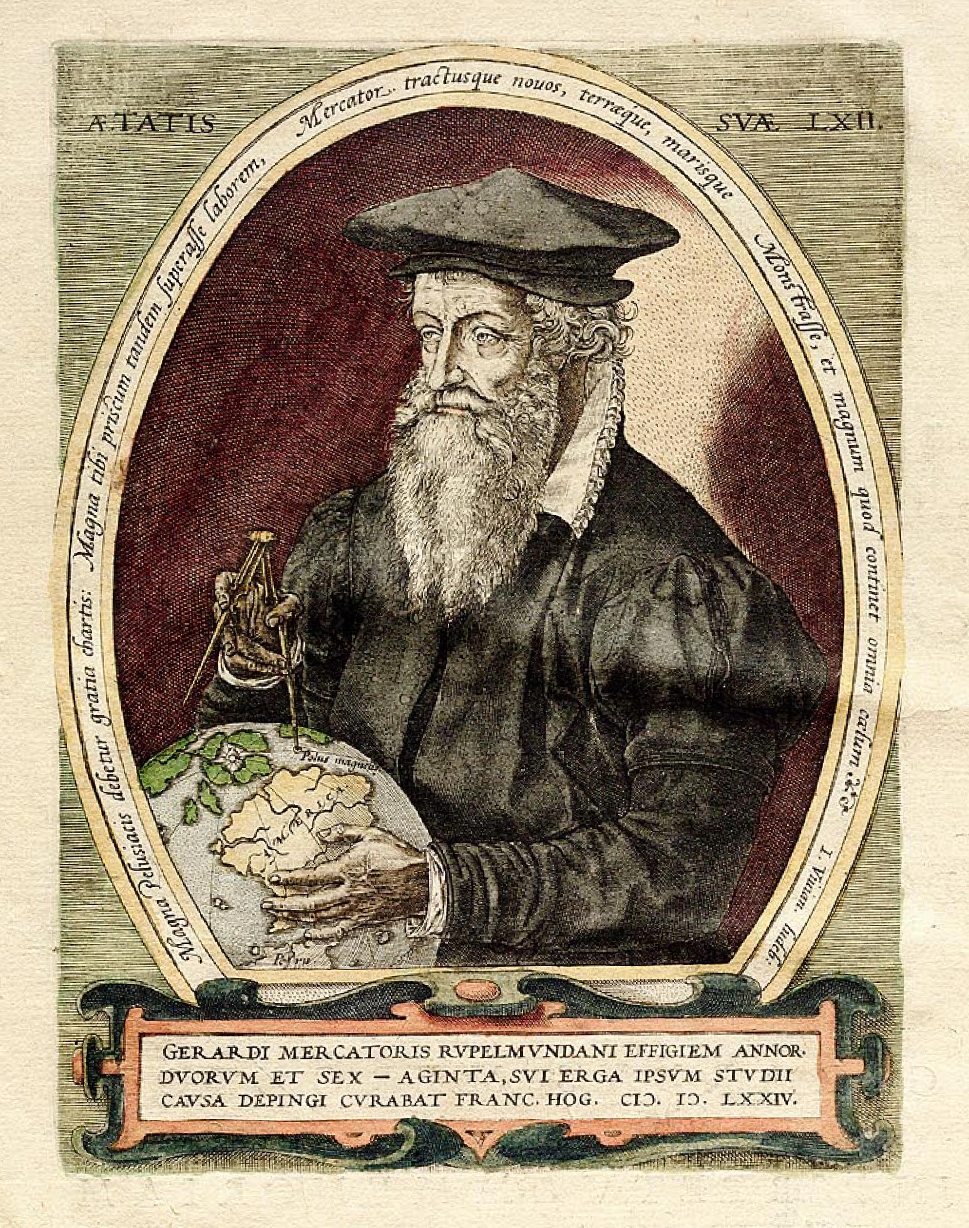
gerardus mercator, engraved portrait, 1572. source: wikimedia commons
The Map That Broke the World to Save It
On this day in 1512 — Gerardus Mercator was born. His map projection distorted the world but made navigation possible.
3 min read
Gerardus Mercator was born on March 5, 1512, in Rupelmonde, Flanders. He became a cartographer at a time when mapmaking was part art, part mathematics, and part guesswork. The problem he inherited was ancient: how do you represent a sphere on a flat surface? Every attempt required compromise. You could preserve shape or preserve area, but not both. You could make distances accurate in one direction but not all directions. The world, being round, resisted being flattened.
Mercator's solution, published in 1569, was a projection that prioritized navigation over geographic accuracy. On his map, lines of longitude and latitude intersected at right angles, forming a perfect grid. This made plotting courses simple. A sailor could draw a straight line between two points and follow it at a constant compass bearing. The route would curve across the actual globe, but on the map it looked straight. The trade-off was that the further you moved from the equator, the more distorted the landmasses became. Greenland appeared larger than Africa, though Africa is 14 times bigger.
The distortion was not a flaw. It was a feature. Mercator designed the map for a specific purpose: ocean navigation. Sailors did not care if Greenland looked enormous. They cared about holding a steady course. The Mercator projection gave them that. It turned the problem of spherical navigation into a problem of plane geometry, something you could solve with a ruler and a compass. The map worked because it was not trying to be the world. It was trying to be a tool.
Mercator's map became the standard for maritime navigation and remained so for centuries. It shaped how Europeans understood global geography, often in problematic ways. The projection made Europe and North America appear disproportionately large, reinforcing colonial attitudes about the importance of northern nations. The visual bias was subtle but persistent. When you see something large on a map, you unconsciously assume it matters more. Mercator never intended that, but design decisions have consequences beyond their original context.
Mercator himself was more than a mapmaker. He was a scholar, engraver, and instrument maker. He coined the term "atlas" to describe a collection of maps, naming it after the Titan condemned to hold up the sky. He created globes, devised new typefaces for cartography, and wrote extensively on cosmology and theology. He was also imprisoned briefly for heresy during the Protestant Reformation, a reminder that ideas about the shape of the world were never purely technical. They were also political.
The Mercator projection is still in use today, though often criticized for its Eurocentric distortions. Cartographers have developed alternatives like the Gall-Peters projection, which preserves area, and the Winkel Tripel, which balances multiple factors. But none have replaced the Mercator for navigation. GPS systems and flight paths still rely on it because the underlying mathematics remain sound. The projection does what it was designed to do, even if the world has changed around it.
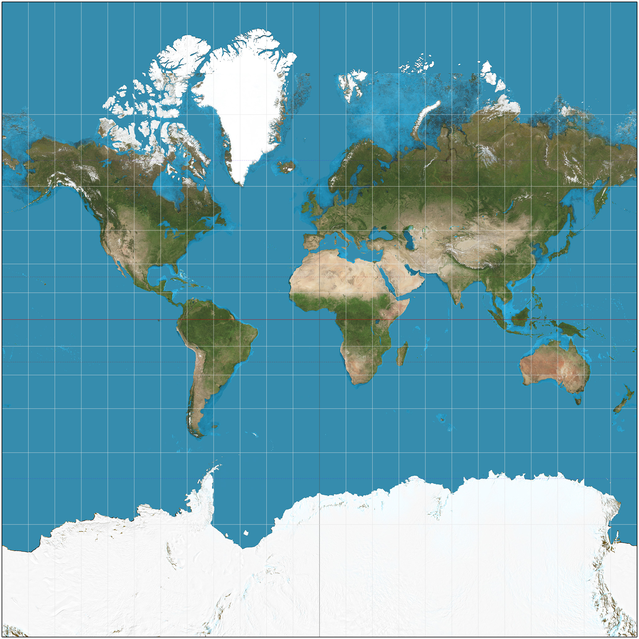
the mercator projection world map — accurate for navigation but distorting the relative sizes of landmasses, particularly near the poles. source: wikimedia commons
Modern digital maps, like those used in web browsers and mobile apps, default to a variant called Web Mercator. It is mathematically simpler than the original and works well for interactive tile-based systems. The choice was pragmatic, not ideological. Engineers needed a projection that could be computed quickly and rendered at multiple zoom levels. Mercator fit the bill. Once again, the tool suited the task, even if it carried historical baggage.
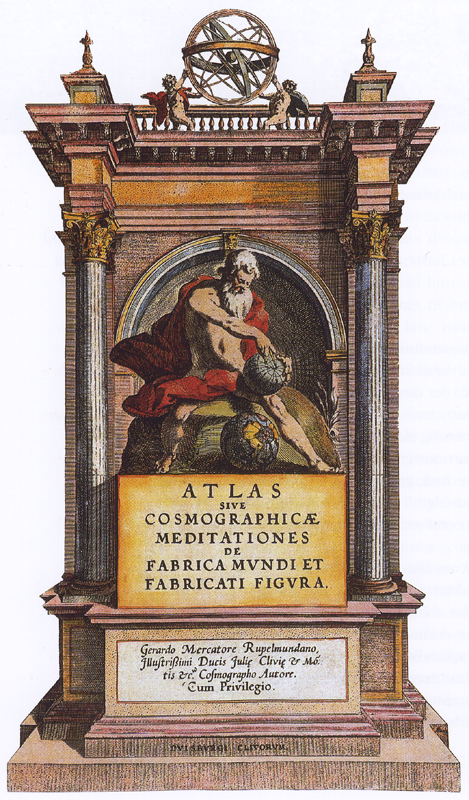
the title page of mercator's 1595 atlas — the book whose name he coined for a bound collection of maps, after the titan condemned to hold up the sky. source: wikimedia commons
What Mercator understood, and what every designer must learn, is that representation is always distortion. There is no neutral view. Every map emphasizes some features and minimizes others. Every interface makes assumptions about what matters. The question is not whether your design is biased but whether the bias serves the purpose. Mercator's map distorted the world deliberately, in service of a goal. It made navigation possible at the cost of geographic fidelity. That is not a failure of design. It is design itself.